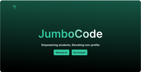
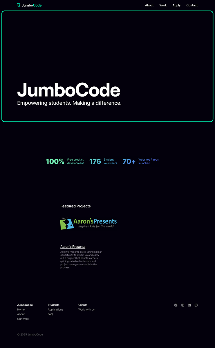
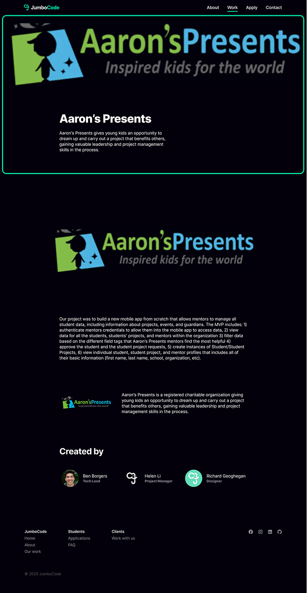
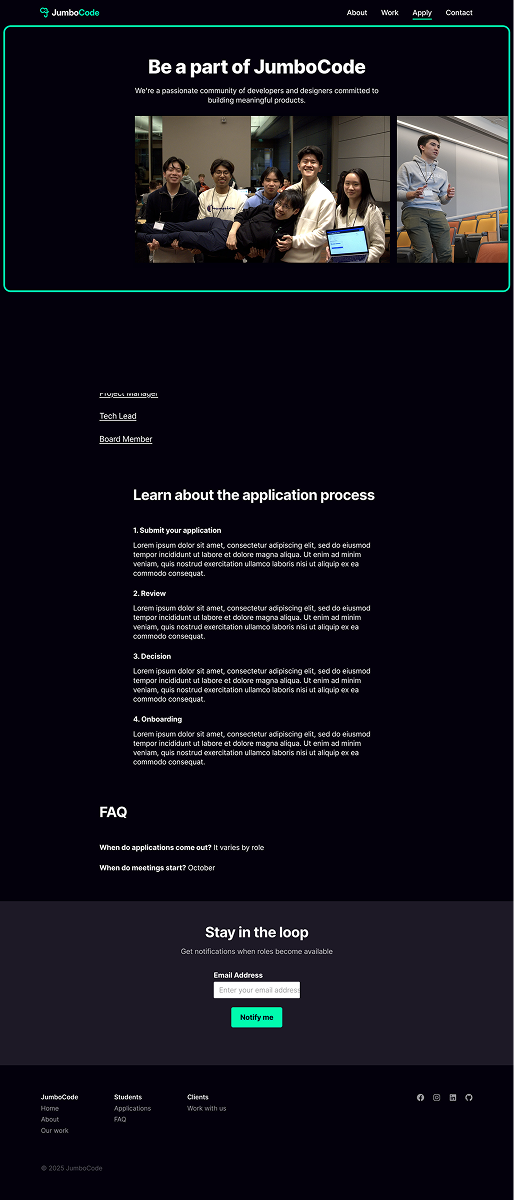
Led the end-to-end redesign of the JumboCode website, increasing student applications by 35%
Product Design
Front-End Development
Design System
0-1
Overview
LIs JumboCode is a student-run digital agency at Tufts that develops free software for nonprofits, with 150+ annual members and 75+ shipped apps.

However, the outdated website failed to clearly communicate the club’s mission or engagement opportunities.

I led the redesign alongside another designer to create a more modern and informative platform, leveraging user interviews and competitive research to better serve prospective students and nonprofit clients.
Figma Prototype
Deployment Coming Soon!
My Role
Head of Design – Interface Design, UX Research, Branding, User Flows, Prototyping
Team
Sristi Panchu, Product Manager
Fa Taepaisitphongse, UI Designer
Ben Borgers, Developer
Holden Kittelberger, Developer
Gabriel Sessions, Developer
Timeline & Status
Summer '24 - Spring '25, One-pager launched September 2024 Full site launching April 2025
Project Outcomes
35%
Increase in applications
(2023 vs. 2024)
4.5x
Growth in total site content
(old site vs. new)
1
Design system for handoff
(no prior documentation)
Research
The old website was outdated and incomplete
We analyzed the old JumboCode website to determine gaps in information and areas for improvements. This allowed us to identify strengths/weaknesses and decide which sections we could reuse for the new design.
Landing Page
About Page
Simple with clear tagline
Lacks captivating visuals (graphics, media)
Inefficient use of screen real estate
Clearly showcases club’s impact through metrics
Stock graphics aren’t consistent with the branding
Content doesn’t say much about what the club does
Project Page
Apply Page
Includes thumbnails of projects
The final solution is not clear
Key takeaways are not scannable
Every collaborator role is listed
Too many subpages creates confusing user journey
Lorem ipsum text conveys unprofessionalism
How can JumboCode stand out?
We conducted a competitive analysis with similar clubs at other universities to identify trends and effective designs. This allowed us to gain insights on how other clubs separated content sections and helped inform our information architecture. Below are 3 of the many clubs that we analyzed.
Overview
Blueprint is a club started at UC Berkeley with many other chapters that develops pro-bono apps for nonprofits and promotes tech for social good.
Atlas Digital is a student consulting organization at the University of Michigan focused on providing technological solutions to businesses, startups, and nonprofits.
Commit the Change is a UC Irvine club focused on creating end-to-end products for Southern California non-profit organizations.
Screenshots
Key Takeaways
• Content is very comprehensive
• Project page doesn’t showcase the   actual solution, it only shows what the   project is about and what the team is   working towards. This could be   unclear to people who want to see the   final product
Many pages are text heavy, especially   the application pages for students
• Have a community video on the   landing page that brings a more   human and real touch to the club
• Has an “our services” section which   allows clients to know what the club   can offer them
Member experience section highlights   community events
Short and limited past project section   doesn’t give much spotlight towards   the project outcome
• Projects are showcased in a portfolio   pdf which makes it easy to send out to   potential clients
• Blog on Medium showcases the club’s   spotlights
Emphasizing the club’s values   demonstrates club brand value and   staying true to their mission
We had to develop (a lot of) new content
Since the original site lacked many details like what JumboCode does, our application process, the project structure, and photos of members, we had to create a lot of new material. We focused on including content relevant to the needs and wants of three key users: current JumboCode members, prospective students, and non-profit organizations. Insights from these user personas informed the development of our information architecture, and we spoke with users to ensure content was logically organized into various sections.
Prototypes
With the Tufts club fair scheduled for early September, we quickly developed a one-pager to show prospective members
This was a quick pivot from our original goal of building an entire site, but it was an ideal opportunity to showcase what we were working towards. We prioritized including high level information like what JumboCode does, past project case studies, application information, and member career paths.
One pager
For the one-pager we prioritized content relevant to prospective students
We dissected the full site information architecture and developed a site map to layout the material we planned to include
It had to be clear what JumboCode does
• We wanted to ensure that users understood our purpose quickly after arriving on the site
• Detailed information about how our year-long projects operate was necessary to include
Specific application details were important
• Wanted to provide a clear overview of our application process to attract prospective students 
• Distinguished between which positions were open and others opening in the spring
With the club fair over, we refocused on building out the full website
Leveraging our information architecture and one pager site map, we developed outlines for each page of the new website. It was important to maintain a consistent structure across different pages so we used similar designs for the hero sections and visuals.
Revamping the hero section was a must
We added a CTA and developed a more engaging tagline but initial designs lacked the character we were looking for
Iteration 1
Similar to old design but includes a CTA and background image
Green border is distracting and text is clumped together
Iteration 2
Heading gradient is odd and the large size is overwhelming
Cleaner, modern design with a simple layout
Iteration 3
Not initially clear that the site is for JumboCode
Different colored CTA buttons creates nice contrast
All roads led to this
We incorporated elements from several of the early iterations to create a balanced and clean landing page
JumboCodes purpose had to be clear
But achieving a balance between captivating visuals and informative descriptions proved to be a challenge
Iteration 1
Spacing between elements and text is off putting
Sub-text is difficult to read and stretches across the screen
Iteration 2
Text chunks have inconsistent lengths causing disarray
2x2 layout is easier to scan and creates consistency
Iteration 3
Centered elements do not flow with other page components
Central photo grabs user attention and compliments text description
Piece by piece, the design took shape
By blending the best parts of our early drafts, we developed a polished and structured about section. Adding complementary photos really helped engage the user and pulled the design together.
Design
In order to better fit with the brand image, many adjustments were made to the design system
Although we referenced and drew from the original club branding, there was no formal documentation regarding the color palette, typography or spacing. Thus to ensure future board members could easily update the website, we created a Figma branding page for our design system and styling choices.
Color Palette
Primary Colors
Brand
#63EEC7
Website Green
#19F6B3
Dark Green
#50B396
Gradient
Secondary & Neutrals
Small Text
#837F8E
Black
#000000
Dark Grey
#212124
White
#FFFFFF
Typography
Aa
Inter
H1
48/60
H2
32/40
H3
28/35
B1
22/24
B1
16/18
Putting it all together we ended with our final solution!
After completing the design in early October, we transitioned to ensuring our developers could understand our vision for specific interactions and the overall scroll experience. I played an advisory role throughout the development process, and took on tickets to build out the navigation and footer.
Landing Page
Before
After
About Page
Before
After
Projects Page
Before
After
Apply Page
Before
After
Project Case Study
Before
After
Community Feedback
Throughout the design process we gathered feedback from Tufts students and the JumboCode community.  

These quotes are some of the positive feedback we received!
Conclusion
Wrapping up the project
Reflection
This website redesign was a testament to all the skills Fa and I developed throughout our time at Tufts. It enabled us to move through the complete design process, from understanding user needs to rapid prototyping to developer hand off. And I loved all of it. Theres no better feeling than building a web application from the ground up.
If I could do it again
Next time, we’d start usability testing earlier and improve our documentation to make the development process smoother for developers and future designers.
Takeaways
One major lesson we learned was the importance of effectively communicating design concepts with developers. We had to ensure that our prototypes were both technically feasible and clear. We also realized that organizational goals can shift quickly, and adapting to new priorities pushed us to think on our feet.
Project Outcomes
35%
Increase in applications
(2023 vs. 2024)
4.5x
Growth in total site content
(old site vs. new)
1
Design system for handoff
(no prior documentation)
Visit the site at www.jumbocode.org