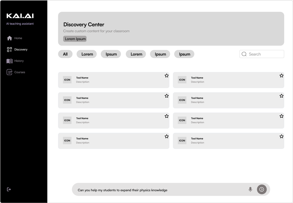
Designed a discovery section encouraging educators to explore 15+ AI teaching tools
Product Design Internship
Web App
Generative AI
Overview
LIs Reality AI is an open-source startup building AI-powered interfaces for educators and enterprise traning teams.

KAI Teaching Assistant equips educators with tools to generate personalized content, but users rarely discovered tools beyond the standard homepage set.

Over a 6-week design sprint, I revamped the discovery experience to increase engagement, achieving an 84% team approval rating during our final critique and earning a promotion to assistant squad lead.
Visit Site
My Role
Product Design Intern | Assistant Squad Lead – User Research, Competitive Analysis, Prototyping, Interaction Design
Team
Savitha Hayavadana, Product Manager
Ogechi Anyanwu, Team Lead
4 Product Design Interns
Timeline
May - August '24
Project Outcomes
32%
Interaction time increase
(based on user testing)
84%
Team approval rating
(from PM evaluation & team feedback)
1
Promotion to a squad lead
(previously an individual contributor)
I first focused on understanding the problem: lack of user engagement
After completing my onboarding, I was given access to a Notion document that outlined the current problem: early users were spending very little time interacting with the KAI interface. My goal was to create a discovery page that inspired users to try out new educational teaching tools and increase engagment time.
Research
• Problem definifing
• User interviews
• Competitive analysis
Prototype
• Low fidelity sketches
• User testing
• High fidelity wireframes
Handoff
• PM review
• Final presentation
The old discovery page provided tools, but didn't encourage user exploration
To bring myself up to speed, I reviewed prior research and product documentation to ground myself in existing insights. I then evaluated the current discovery experience to understand why users weren’t engaging with KAI’s tools — uncovering key downfalls in page structure, and overall interactivity.
Old Discovery Page
With just 6 weeks, we sought out a few quality interviews with educators
To quickly validate our assumptions and gather fresh perspective, we interviewed 8 educators about their experience using KAI for the first time and asked them about changes they would make to the interface. I also took note of how long users spent on the interface and used that as a baseline metric for future comparisons. Overall feedback revealed key barriers to engagement, including unclear tool value and a lack of starting points, which helped us define early design priorities.
"
I saw all these great tools, but there wasn’t much explaining about what they did. Without any kind of recommendation or starting point, I didn’t really know what to click on first.
_____________________________
High School English Teacher
User pain points
No clear starting point
The discovery page didn’t guide users toward relevant tools or suggest where to begin
Unclear tool descriptions
Tool cards lacked context, making it hard for users to understand what each tool did or why it mattered
Low incentive to explore
Without recommendations or filtering, browsing tools felt random and rarely led to new discoveries
To help inform our next steps, I analyzed how other platforms approached discovery
Building on early user insights, I analyzed discovery flows from platforms like KhanMigo, Netflix, and Instagram to understand how they introduce features, guide users, and drive continued engagement. This allowed me to identify effective approaches that could be adapted for the KAI interface.
KhanMigo
Tools are grouped by color, making it easy to visually scan
Each tool has a short description that explains what it does
Netflix
Custom tailored carousels guide exploration in digestible chunks
Previews on hover provide users with a quick overview
Instagram
Content is presented in a dynamic grid that invites discovery
Users can browse content and navigate back to prevous screen
After consolidating our research, I started mocking up some lo-fi screens 
Drawing from both user insights and patterns observed in other platforms, I began translating ideas into low-fidelity wireframes. My goal was to explore layouts that introduced tools more intentionally and encouraged continued exploration. Below are two of my sketches.
Iteration 1
Iteration 2
Grid layout improves scannability and helps users compare multiple tools quickly
Search bar and nav tags offer flexible discovery paths, supporting users who have specific needs
No curated recommendations or break between different tools makes the layout feel flat
Every tool carries the same visual weight, offering little direction for further exploration
“Top Picks” creates a clear entry point that helps guide new users who aren’t sure where to begin
Category tabs help narrow focus and reduce cognitive overload by organizing tools
Hero elements distract from tool exploration and shift attention away from discovering features
Elements are misaligned and uneven spacing between componenets disrupts the layout flow
Guided by PM feedback, I moved into Figma and continued iterating
With feedback from my PM and teammates, I began translating key elements from each sketch into more structured prototypes. My PM emphasized the need to include more interactive elements—so I focused on designing features that made KAI feel more like an active assistant than a static website. This included clearer CTAs, personalized recommendations, and layouts that encouraged further exploration.
Iteration 3
Iteration 4
✅  What I Kept
Grid-based layout and scannable tool cards from iteration 1
🔄  What I Changed
Shifted the location of some nav elements and buttons
🎯  Why It Mattered
Supports quicker browsing and invites interaction with KAI
✅  What I Kept
“Top Picks” and category tabs from iteration 2
🔄  What I Changed
Grouped tools by context (recently used, similar to, etc...)
🎯  Why It Mattered
Creates clear entry points and encourages further discovery
I then turned to user testing to validate my designs
To assess how well the discovery experience supported exploration, I ran usability tests with 6 educators. We lets users freely explore the interface as we tracked engagement time, number of clicks, and gathered direct feedback to understand what worked — and what still needed refinement.
Participants
06
Avg. engagment time
2m 17s
Avg. clicks
5.4
The Good
The large banner felt inviting and gave users a clear place to start
Tool categories like "Recently Used" helped users navigate tools with ease
The tabbed layout made the interface feel organized and encouraged exploration
The Bad
Both design iterations felt boxy, visually flat, and lacked excietment
Users expected more interaction with KAI and the chat function felt disconnected
Tool cards lacked hierarchy, leaving users unsure where to focus
The final design focused on making discovery feel dynamic and personalized
To drive deeper engagement, I refined the interface to highlight relevant tools, integrate contextual guidance, and make KAI feel more like an active assistant. From profile-based suggestions to a responsive discovery chat, every element was designed to encourage exploration and interaction.
Final Discovery Page
Discovery Chat
Closing the loop with testing and handoff
After presenting our final designs to the PM and dev team, we ran final testing sessions to understand how the new discovery experience improved engagement.
Reflection 💭
This internship project challenged me to move fast without cutting corners. With just six weeks, I had to act quickly while balancing user needs, business goals, and technical limitations. It was also my first time designing for an AI-driven interface, which pushed me to think differently about how users interact with intelligent systems. Seeing the increase in user engagement with the final product made the entire process incredibly rewarding.
If I could do it again 🔄
I’d start usability testing earlier and use a more structured script. While open exploration gave us valuable insights, running A/B tests across different flows could’ve helped us compare outcomes and make stronger design decisions.
Takeaways 🔑
I learned how valuable it is to approach PMs with targeted questions—not just about design tweaks, but about the broader product vision. These conversations helped clarify the real purpose behind the redesign and led to stronger decisions. I also gained experience working within a design system, learning how to interpret existing components and make thoughtful design choices within constraints.
Status 📈
July 2024 – Design approved for handoff
Fall 2024 – KAI rebranded to Marvel AI
Project Outcomes
32%
Interaction time increase
(based on user testing)
84%
Team approval rating
(from PM evaluation & team feedback)
1
Promotion to a squad lead
(previously an individual contributor)